
Unemployment Rate in Chicago
R
Summary
I am interested in knowing what relationship unemployment rate has with other factors in the city of Chicago, IL. Specifically, I want to see how decreasing the unemployment rate can also solve some of the other cities problems. I want to explore the relationships of unemployment rate to the rate of people with no high school diploma, the assault and homicide rate, the infant mortality rate, the teen birth rate, and birth rate. After running the analyses, it was found that unemployment rate has a positive correlation to the rate of people with no high school diploma, the assault and homicide rate, the infant mortality rate, the teen birth rate, and the birth rate. The strongest relationship is between unemployment rate and the homicide and assault rate, meaning that if we wants get the unemployment rate down and the crime rate down, we should focus on crime ridden areas and/or work on getting more people in the city of Chicago employed.
Data
The data was pulled from the City of Chicago website and four data sets were used. The first is census data from 2008 to 2017, the second and third are public health statistics data sets for life expectancy and other indicators, and the fourth is a data set on motor vehicle thefts that include community area and location to map latitude and longitude. (Note: data exploration output was excluded from this analysis)
Analysis
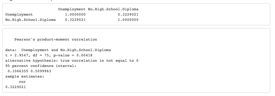
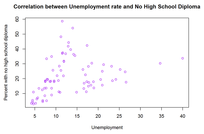
Correlation between unemployment rate and people with no high school diploma
A correlation was run to see if there was a relationship between unemployment rate and the rate of people with no high school diploma. From the first table you can see that there is a positive correlation between Unemployment and No.High.School.Diploma, with a value of 0.323 and from the second output you can see that there is a p-value of less than 0.05. Within the graph you can see that as the unemployment rate goes up, the no high school diploma rate goes up as well. With this information, we can conclude that there is a positive relationship between unemployment rate and no high school diploma rate.
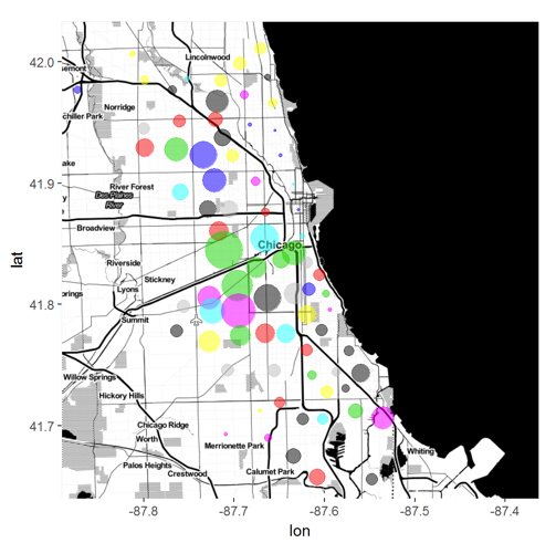
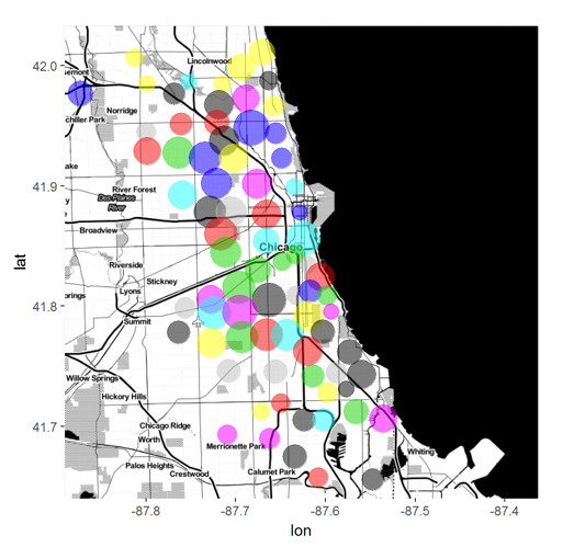
If you look at the map you can see that there are higher rates of individuals that don’t possess a high school diploma in the center, which is the inner city.
Correlation between unemployment rate and assault and homicide rate
A correlation was run to see if there was a relationship between unemployment rate and assault/homicide rate. From the first table you can see that there is a positive correlation between Unemployment and Assault..Homicide., with a value of 0.815 and from the second output you can see that there is a p-value of less than 0.05. Within the graph you can see that as the unemployment rate goes up, the assault and homicide rate goes up as well. With this information, we can conclude that there is a positive relationship between unemployment rate and assault and homicide rate.
If you look at the map you can see that there is a higher rate of assault and homicide in the bottom right, which is right below the inner city.


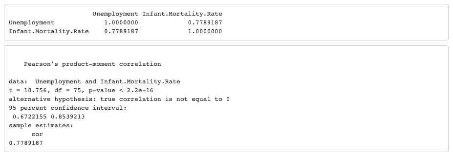
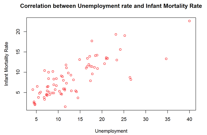
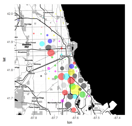
Correlation between unemployment rate and infant mortality rate
A correlation was run to see if there was a relationship between unemployment rate and infant mortality rate. From the first table you can see that there is a positive correlation between the variables Unemployment and Infant.Mortality.Rate, with a value of 0.779 and from the second output you can see that there is a p-value of less than 0.05. Within the graph you can see that as the unemployment rate goes up, the infant mortality rate goes up as well. With this information, we can conclude that there is a positive relationship between unemployment rate and infant mortality rate.
If you look at the map you can see the distribution of high infant mortality rates is all over the city of Chicago, with the rates getting higher as you get closer to the water and the inner city.
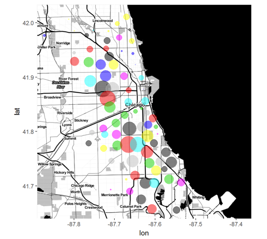
Correlation between unemployment rate and teen birth rate
A correlation was run to see if there was a relationship between unemployment rate and teen birth rate. From the first table you can see that there is a positive correlation between the variables Unemployment and Teen.Birth.Rate, with a value of 0.713 and from the second output you can see that there is a p-value of less than 0.05. Within the graph you can see that as the unemployment rate goes up, the teen birth rate goes up as well. With this information, we can conclude that there is a positive relationship between unemployment rate and teen birth rate.
If you look at the map you can see there is a wide distrution of high teen birth rates within Chicago. Not one area stands out as having the highest.


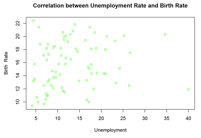
Correlation between unemployment rate and birth rate
A correlation was run to see if there was a relationship between unemployment rate and birth rate. From the first table you can see that there is a positive correlation between the variables Unemployment and Birth.Rate, with a value of 0.195 and from the second output you can see that there is a p-value of 0.194. Within the graph you can see that as the unemployment rate goes up, the birth rate goes up as well. With this information, we can conclude that there is a positive relationship between unemployment rate and birth rate, but it is not a very strong one.
If you look at the map you can see that the birth rate is pretty high everywhere in Chicago. The rates get lower as you get further out of the city.

Conclusion
In conclusion, there is a positive relationship between unemployment and no high school diploma rates, assault and homicide rates, infant mortality rates, teen birth rates, and birth rate, meaning that as unemployment goes up so do all of those variables and when unemployment goes down so do all of them as well. The strongest relationship is between unemployment and the assault and homicide rate. There is also a very strong relationship between unemployment and infant mortality rate and unemployment and teen birth rate. There is not a strong relationship between unemployment rate and general fertility rate and unemployment and no high school diploma rate. With these findings, we can understand that as you lower unemployment rate, the rest of the rates will lower as well. Focusing on the variables that have the strongest relationship will be the most beneficial and will help lower unemployment rates overall.
Code
library(knitr)
opts_chunk$set(echo = TRUE) #sets knitr chunk options
setwd("C:/Users/morga/Documents/Quarter_4/RandSAS/R/Briefs/Brief4")
library(dplyr)
library(ggplot2)
CrimeData <- read.csv("crimechicago.csv")
CensusData <- read.csv("Census_Data_-_Selected_socioeconomic_indicators_in_Chicago__2008___2012.csv")
LifeExpData <- read.csv("Public_Health_Statistics-_Life_Expectancy_By_Community_Area.csv")
HealthData <- read.csv("Public_Health_Statistics-_Selected_public_health_indicators_by_Chicago_community_area.csv")
AvgLat <- aggregate(Latitude ~ CommunityArea, CrimeData, mean)
AvgLong <-aggregate(Longitude ~ CommunityArea, CrimeData, mean)
AllData <- left_join(HealthData, CensusData, by=c("Community.Area"="Community.Area.Number"))
AllData <- left_join(AllData, LifeExpData, by=c("Community.Area"="Community.Area.Number"))
AllData <- merge(AllData, AvgLat, by.x = "Community.Area", by.y= "CommunityArea")
AllData <- merge(AllData, AvgLong, by.x = "Community.Area", by.y= "CommunityArea")
AllData <- select(AllData, Community.Area, Community.Area.Name, Birth.Rate, Teen.Birth.Rate, Assault..Homicide., Infant.Mortality.Rate, No.High.School.Diploma, Unemployment, Latitude, Longitude)
saveRDS(AllData,"DoddsBrief4.rds")
#View(AllData)
knitr::opts_chunk$set(echo=FALSE,
warning = FALSE,
message = FALSE,
comment = NA)
AllData$Community.Area.Name
hist(AllData$Birth.Rate, main="Histogram of Birth Rate", xlab="Birth Rate",col="blue")
hist(AllData$Teen.Birth.Rate, main="Histogram of Teen Birth Rate", xlab="Teen Birth Rate",col="orange")
hist(AllData$Assault..Homicide., main="Histogram of Assault and Homicide Rate", xlab="Assault/Homicide Rate",col="green")
hist(AllData$Infant.Mortality.Rate, main="Histogram of Infant Mortality Rate", xlab="Infant Mortality Rate",col="yellow")
hist(AllData$No.High.School.Diploma, main="Histogram of No High School Diploma Rate", xlab="No High School Diploma Rate",col="red")
hist(AllData$Unemployment, main="Histogram of Unemployment Rate", xlab="Unemployment Rate",col="purple")
UN_Cor <-select(AllData, Unemployment, No.High.School.Diploma)
cor(UN_Cor)
cor.test(~Unemployment + No.High.School.Diploma, data=UN_Cor)
plot(AllData$Unemployment,AllData$No.High.School.Diploma,col="purple", xlab="Unemployment", ylab="Percent with no high school diploma",main="Correlation between Unemployment rate and No High School Diploma")
library(ggmap)
myLocation <- c(-87.53,41.65, -87.87,42.01)
myMap <- get_map(location = myLocation,
source = 'stamen',
maptype = 'toner',
crop = FALSE,
zoom = 11)
g <- ggmap(myMap)
g + geom_point(aes(x = Longitude, y = Latitude),
data = AllData,
alpha = .5,
color = AllData$Unemployment,
size = AllData$No.High.School.Diploma/5)
UA_Cor <-select(AllData, Unemployment, Assault..Homicide.)
cor(UA_Cor)
cor.test(~Unemployment + Assault..Homicide., data=UA_Cor)
plot(AllData$Unemployment,AllData$Assault..Homicide.,col="blue", xlab="Unemployment", ylab="Assault/Homicide Rate",main="Correlation between Unemployment rate and Assault/Homicide Rate")
library(ggmap)
myLocation <- c(-87.53,41.65, -87.87,42.01)
myMap <- get_map(location = myLocation,
source = 'stamen',
maptype = 'toner',
crop = FALSE,
zoom = 11)
g <- ggmap(myMap)
g + geom_point(aes(x = Longitude, y = Latitude),
data = AllData,
alpha = .5,
color = AllData$Unemployment,
size = AllData$Assault..Homicide./5)
UI_Cor <-select(AllData, Unemployment, Infant.Mortality.Rate)
cor(UI_Cor)
cor.test(~Unemployment + Infant.Mortality.Rate, data=UI_Cor)
plot(AllData$Unemployment,AllData$Infant.Mortality.Rate,col="red", xlab="Unemployment", ylab="Infant Mortality Rate",main="Correlation between Unemployment rate and Infant Mortality Rate")
library(ggmap)
myLocation <- c(-87.53,41.65, -87.87,42.01)
myMap <- get_map(location = myLocation,
source = 'stamen',
maptype = 'toner',
crop = FALSE,
zoom = 11)
g <- ggmap(myMap)
g + geom_point(aes(x = Longitude, y = Latitude),
data = AllData,
alpha = .5,
color = AllData$Unemployment,
size = AllData$Infant.Mortality.Rate/2)
UT_Cor <-select(AllData, Unemployment, Teen.Birth.Rate)
cor(UT_Cor)
cor.test(~Unemployment + Teen.Birth.Rate, data=UT_Cor)
plot(AllData$Unemployment,AllData$Teen.Birth.Rate,col="orange", xlab="Unemployment", ylab="Teen Birth Rate",main="Correlation between Unemployment rate and Teen Birth Rate")
library(ggmap)
myLocation <- c(-87.53,41.65, -87.87,42.01)
myMap <- get_map(location = myLocation,
source = 'stamen',
maptype = 'toner',
crop = FALSE,
zoom = 11)
g <- ggmap(myMap)
g + geom_point(aes(x = Longitude, y = Latitude),
data = AllData,
alpha = .5,
color = AllData$Unemployment,
size = AllData$Teen.Birth.Rate/10)
UG_Cor <-select(AllData, Unemployment, Birth.Rate)
cor(UG_Cor)
cor.test(~Unemployment + Birth.Rate, data=UG_Cor)
plot(AllData$Unemployment,AllData$Birth.Rate,col="green", xlab="Unemployment", ylab="Birth Rate",main="Correlation between Unemployment Rate and Birth Rate")
library(ggmap)
myLocation <- c(-87.53,41.65, -87.87,42.01)
myMap <- get_map(location = myLocation,
source = 'stamen',
maptype = 'toner',
crop = FALSE,
zoom = 11)
g <- ggmap(myMap)
g + geom_point(aes(x = Longitude, y = Latitude),
data = AllData,
alpha = .5,
color = AllData$Unemployment,
size = AllData$Birth.Rate/2)